Branding · 2023
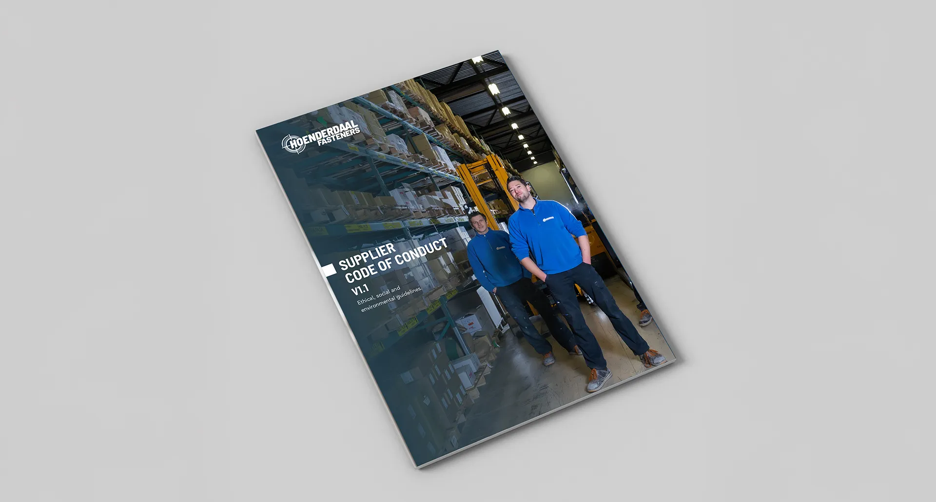
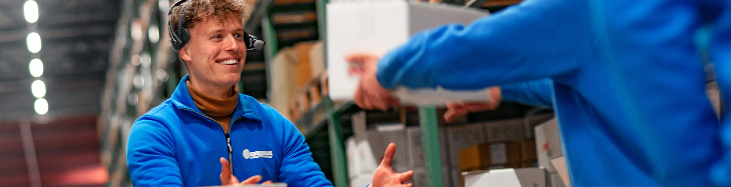
In 2023, Hoenderdaal Fasteners approached me to collaborate on both graphic to digital design work. It quickly became clear that the branding was inconsistent, with logo usage varying across different media and products. Having just launched a significant overhaul to their website, the brand could not be left behind as new standards were set with their brand new online client platform, allowing customers to directly order from their business account.
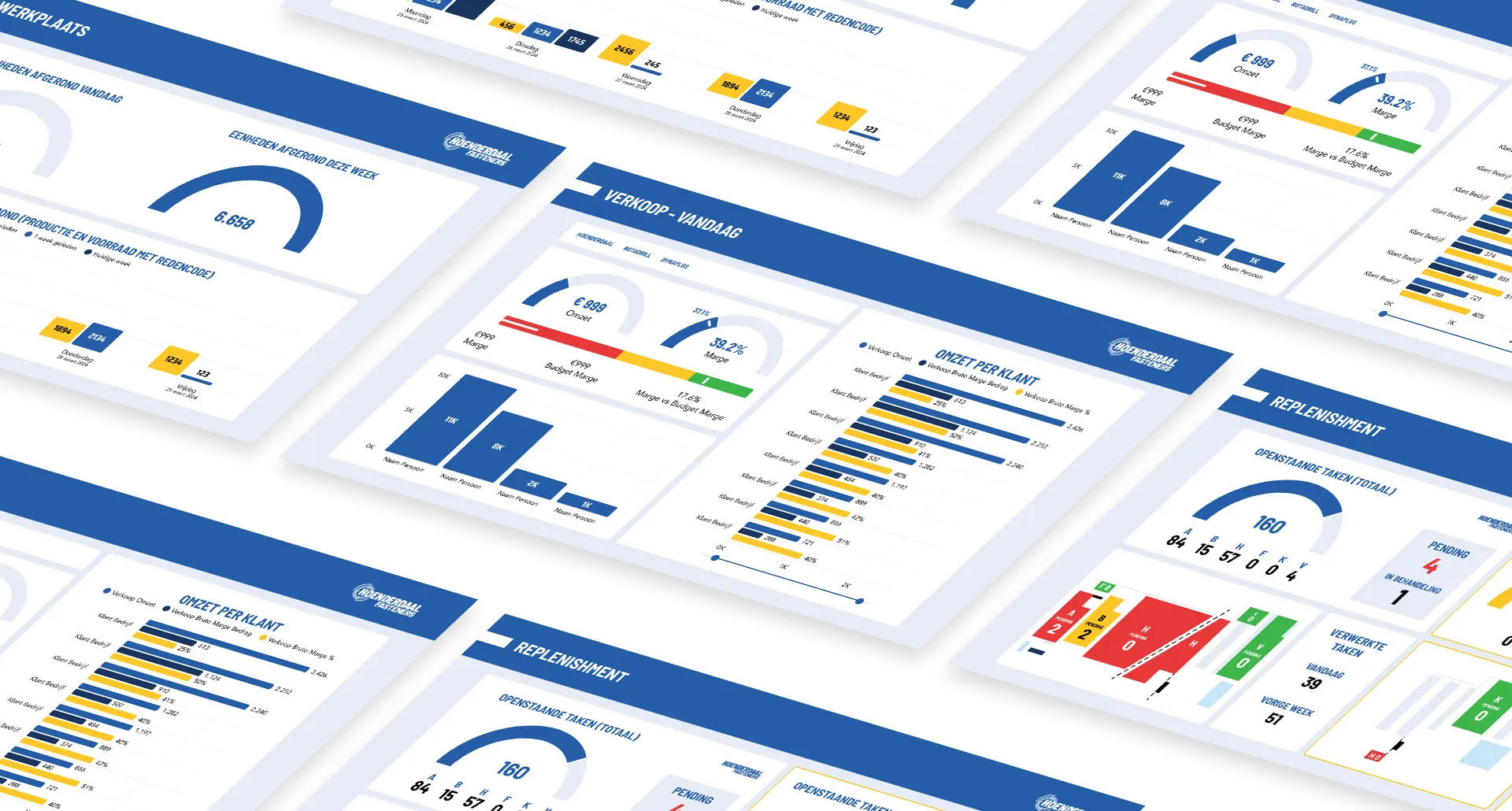
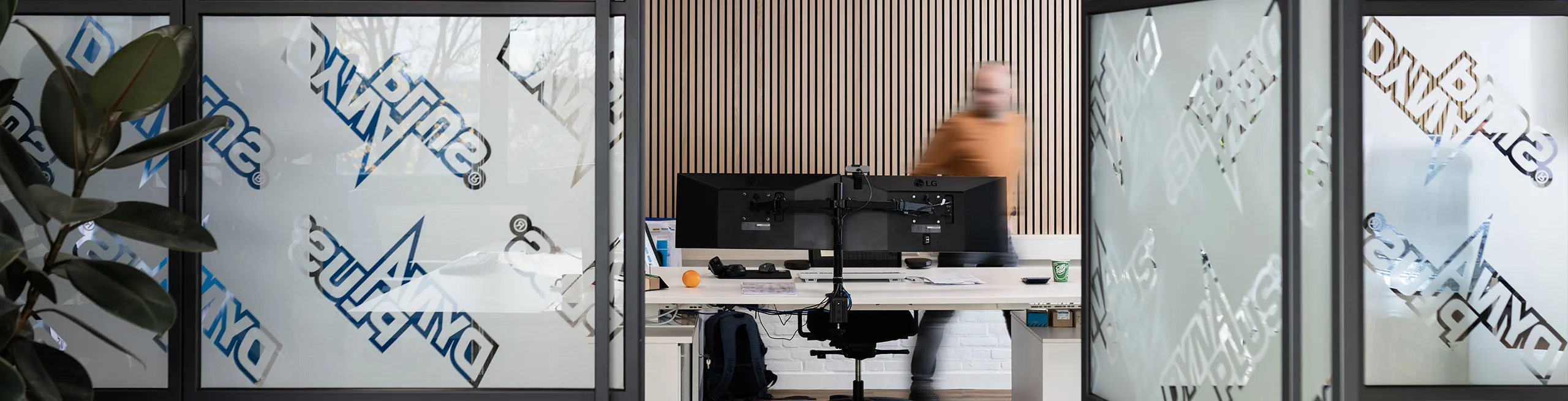
The brand is seen everywhere around the workplace, ranging from data dashboards across the warehouse, to conference presentations, the website, and even social media. Despite that, dozens of variations of blue are used, a wide range of design choices are applied across platforms. This inconsistency became a key issue to resolve, combined with modernization to accommodate to show how much the company has evolved throughout its history.
A new logo is introduced with more consistent typography, applying the same font as used in other content.
The primary colour scheme is reworked, introducing different shades of blue to account for various usecases. This can help separate content more accurately.
Ice Blue
Hoenderdaal Blue
Deep Blue
Marine Blue
A secondary colour scheme is introduced, to be used in data visualization, company presentations, or simply to refer to brands under the Hoenderdaal Umbrella.
Dark Red
Red
Light Red
Dark Orange
Orange
Light Orange
Dark Yellow
Yellow
Light Yellow
Dark Green
Green
Light Green
Dark Alt Blue
Alt Blue
Light Alt Blue
A secondary colour scheme is introduced, to be used in data visualization, company presentations, or simply to refer to brands under the Hoenderdaal Umbrella.